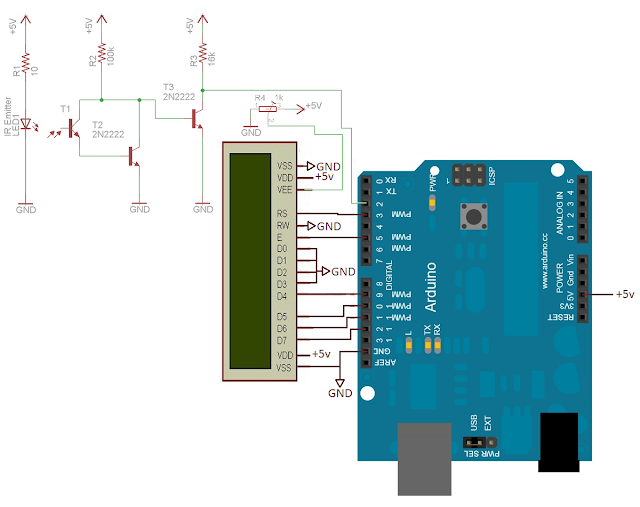
Here is an example of the Aesthetic we are aiming for, however there is a balance between the amount of information we provide.
These First two images may provide too much information confusing the user, whereas these next two are more user friendly. Also worth noting is type of diagram we provide, from an electronics point of view or a more physical photographic example to which the user can compare.
The diagrams we create are from Daming's work which we recorded. Below are examples that both Daming and myself recorded.
We can also include an exploded view of the final design we use for the wheel / dashboard.
Because the code is not too long, and the nature of it we will include the entirety within.


No comments:
Post a Comment